Evaluation
In what ways does my media product use, develop or challenge forms and conventions of real media products?
Cover:
My media product uses a lot of conventions of real media products such as other music magazine s ‘Vibe’ and ‘The Source’ as I have a mast head which is the most prominent piece of text on my cover. As it draws the eye of the audience as it is the first thing they will see along the route of the eye. Using the route of the eye technique I decided to place my Main image for my cover around the centre of the page, as it is the next spot along the route of the eye and it is around all of the hot spots for the principle of thirds. My image is also the largest object on the page so the audience will see this and will be draw to the magazine to discover who is the image of and to find out what the main article in the magazine is about. I’ve also used another convention of real magazines that I have used in mine, is that the artist in the image in the cover is from the main feature in the magazine. I have also used cover lines to show other artists that are featured in my magazine and other features in the magazine. I have also incorporated other forms of cover lines such as the competition, this draws in the audience as they see they have a chance to win something which makes them want to buy the magazine.
 s ‘Vibe’ and ‘The Source’ as I have a mast head which is the most prominent piece of text on my cover. As it draws the eye of the audience as it is the first thing they will see along the route of the eye. Using the route of the eye technique I decided to place my Main image for my cover around the centre of the page, as it is the next spot along the route of the eye and it is around all of the hot spots for the principle of thirds. My image is also the largest object on the page so the audience will see this and will be draw to the magazine to discover who is the image of and to find out what the main article in the magazine is about. I’ve also used another convention of real magazines that I have used in mine, is that the artist in the image in the cover is from the main feature in the magazine. I have also used cover lines to show other artists that are featured in my magazine and other features in the magazine. I have also incorporated other forms of cover lines such as the competition, this draws in the audience as they see they have a chance to win something which makes them want to buy the magazine.
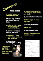
  I have used a lot of conventions from a real music magazine when creating my music magazine, for example I put the mast head at the top of the page, so it is clear to the reader that it is the contents page and they can look at it to navigate around the magazine, I have also put an image of the cover on the contents page with an advert about subscribing to the magazine. I did this as I had seen a lot of magazines do it in my research. I also kept the same colour scheme as the Cover. This makes the magazine look better as there is a set colour scheme rather than just random colours. I also incorporated an editor’s letter onto the contents page as I had seen them when I was researching and thought it was a good idea to have one in my magazine.
Double-Page Spread
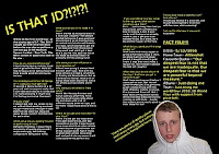
 For my double-page spread I decided to keep the same colour scheme as my other two pages as it makes it look more official. I also used a quote from the text as I had seen it used when I was doing my research and it pulls the reader in and makes them want to read the interview. I also incorporated a picture of the artist that the article is about as it ties in with the article and adds something to the page that will grab the readers attention. I have also used a fact file as it is a separate piece of text and I didn’t want there to be massive blocks of text on the page as it does not look very good and the reader may not want to read a lot.
How does my Media product represent particular social groups?
My media product represents the Rap music fans; I have done this by using the clothes a rapper/rap fan would wear in my images. I have also incorporated different rappers on my cover in order to pull in the target audience and to show what genre I am trying to appeal to and represent. I have also used language that will appeal to rap music fans. Another group that my media product represents is Young adults as they are stereo- typed as listening to rap music, so I have used language that a young adult would use and would understand, I have also used artists that they would of heard of rather than old artists as that would be an older group of people who would listen to them.
What kind of media institution might distribute my media product and why?
Intermedia partners would be likely to distribute my magazine as they produce other Music magazines such as 'VIBE'. This would mean they know the magazine market and they would know how to advertise my product. They also know what the target audince wants on a larger scale which will enable my magazine to appeal to other audiences other than just one specific social group. They also own VIBE holdings LLC which is a well established brand which distributes the urban music magazine VIBE this will help my magazine as they are experienced and they are already established in the market. Intermedia Partners also own Soultrain holdings LLC which owns a library of music from R&B to Hip Hop which will help my magazine as they are already linked to music artists and they know who is popular and who isn't so that would help the magazine as they would be able to see which artists people like at a certain time and put them in the magaizne.
What feed back did I get from my audience?
I did a survey to see what the audience thought of my magazine, 90% liked the colour scheme and thought it was good for the genre of music, and that it was consistant which made the magazine look better where as 10% felt that the colour scheme should have been more varied. 60% Liked the main image on the cover and said it stood out well and was eye-catching to pull them in, however 40% felt that the image did not show the genre of the magazine. 30% of the audience liked the font and said that it was vaired enough to see the difference but it wasnt miles too different which looked good, however the other 70% thought that the fonts could have been more vaired as they looked to similar. On the contents page 100% of the audience would have prefered an image of the main artist than an editors letter.
How did I attract/address my audience?
I also used the language that audience would use and I didn’t use a lot of text as young people want to get straight to the point so they can move onto something else. I also addressed my audience using competitions on the cover, which will draw people in who are attracted by the prize. I’ve also placed names of other rappers on the cover which will draw in people who like their music, or are drawn to them personally. This would make more people be attracted to the magazine as there is more in the magazine than just one article about one artist.
What have I learnt about the technologies from the process of constructing this product?
I have learnt how to use publisher to make a magazine and a double page spread, I have also learnt how to save a document as an image using publisher. I have also learnt how to construct a blog, using blogger.com. I also used cameras during my shoots for the photos that feature in my magazine and learned about how light affects the shots and how they turn out.
Looking back at the preliminary task, what do I feel I have learnt about in the progression from it to my main product?
I have learnt that it is harder to make a music magazine than a school magazine as you need to be able to attract a wide scale of people to your magazine, and with a school magazine you can use the school colours as the colour scheme where as you have to think of a new colour scheme for your music magazine as it has to stand against other magazineszso it has to look fresh and cool, it is also hard to make a music magazine as there are so many already and it was heard to look at them for inspiration but not to use their ideas in my own magazine. Whereas with a school magazine I was able to make my own version as there are not many school magazines around.


